

Picture an investor on an iPad, reading about a company they just heard about on a podcast. They like what they see. They tap "Request access". Nothing happens. They tap again. Then they close the tab and open the next company on their list.
That is not a made-up scene. It is what happened, on the day we looked, to anyone who opened one of the newest Y Combinator companies on a tablet or a laptop. The page looked perfect. The one thing every visitor is meant to do could not be done.
At Spectra we spend our days on moments like that one: the gap between what a website is supposed to do and what its visitors actually go through. So we took the freshest, fastest-moving group of companies we could find, the two newest YC batches, and asked two questions. Does their website really work for the people using it? And if something went wrong tomorrow, would they ever find out?
What did we study?
Every company in Y Combinator's Summer 2026 and Fall 2026 batches that lists a website: 373 startups, 366 of which loaded for us. Most of them are AI companies, and most are only a few months old.
For each one we opened the home page, the pricing page and the sign-up or demo page when there was one: 636 pages in all. Every page was studied at four screen widths, two phones, a tablet and a laptop, and on each we looked at what a visitor could and could not actually do. That came to 55,510 checks.
We also recorded what each website runs to understand its own visitors: anything that records a visit, catches an error or measures behaviour.
The scope, plainly. This is a study of each company's public website: the pages a prospect, customer or investor lands on before signing in. It says nothing about the product behind the log-in, where many of these teams may well measure everything. What a website runs was read from its home page, in a real browser, as a first-time visitor who has not yet answered the cookie notice, on one day in October 2026. A service that only starts after a visitor accepts cookies, or later in a visit, would not be counted, so the true share is likely a little below 85%. The problems in the next sections were all on these public pages, and every one was confirmed with a real tap.
We are not naming anyone. These are young companies doing hard things, and every problem below takes minutes to fix once somebody knows about it. That is rather the point.
Can these teams see what visitors go through on their websites?
This is the number that surprised us most, so it comes first.
Six in ten of these websites run nothing at all that tells the team anything about its visitors. Of the rest, most count visits and stop there.
A visitor count tells you how many people arrived. It cannot tell you what happened to them next. When an experience breaks, there is usually nothing to count: no error is raised, no request fails, the page loads in a fraction of a second. A visit is recorded as perfectly normal, and then the visitor is gone.
- 1 changea new picture, banner or menu link goes live
- 0 errorsnothing fails and nothing is logged
- 1 visitcounted as perfectly normal
- 1 customergone, without a word
The pattern behind every problem in this research.
And here is the uncomfortable part. Of the eight companies with a problem we describe below, six ran nothing that records a visit or catches an error. The other two did record their visitors, including the company whose main call to action could not be pressed. The recordings were there. The problem was still live when we looked. Footage nobody happens to open is a very good alibi and a very poor alarm.
What were visitors running into?
Most of these websites work. That deserves saying, because it is a credit to the people who build them. Out of 366, five had something a visitor simply could not use, and three more greeted every new visitor with their most important call to action hidden under a cookie notice.
about 1 in 46: something visitors couldn't use on arrivaleverything we studied worked
Here they are, without the names.
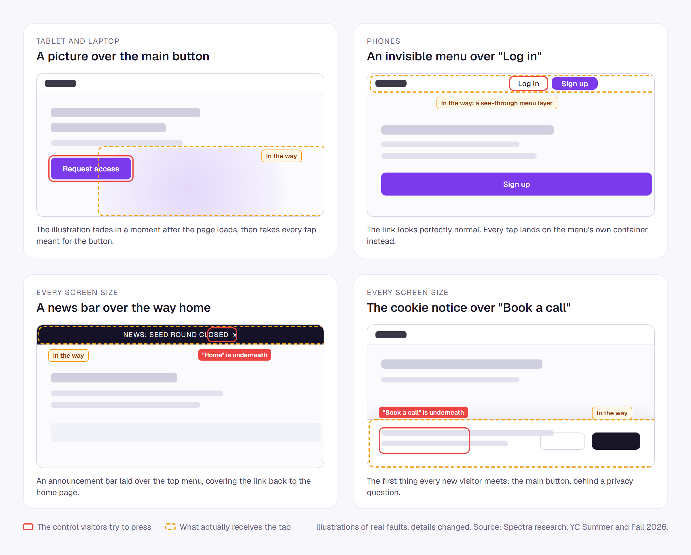
- The main call to action, under a picture. An AI infrastructure company's "Request access" button, the only call to action on the page, sat beneath the large illustration beside it on tablets and laptops. The illustration fades in as the page loads, and once it has, it quietly takes every tap meant for the button. On phones, where the layout stacks, it worked.
- "Log in", under an invisible menu. A mental health company's log-in link on phones sat beneath the container for its own navigation menu. The container is see-through, so the link looks perfectly normal. Every tap lands on the container instead.
- "Home", under a news bar. A defence hardware startup announcing its funding round laid a bar across the top of its contact page. On every screen size, the bar covered the link back to the home page.
- A link squeezed out of a crowded menu. A developer company's top menu fits on a laptop and on a phone. At tablet width it does not, and the last link slid underneath its neighbour, where nobody can reach it.
- A contact address beneath an animation. Another defence company's email address sat under the animated scene on its home page at every size. It is there in the page. No visitor can see it or reach it.
And the three that greeted visitors with a wall:
- "Book a call", under the cookie notice, on every screen. A company whose main call to action is "Book a call" placed its cookie notice directly over it, on phones, tablets and laptops alike.
- "See how it works", under a cookie card. On a laptop, a friendly cookie card in the corner of the screen covered half of the main hero button.
- "Continue on your computer", under the cookie text. On an order page, at tablet width.
A cookie notice can be closed, so these do come back. But the first thing every new visitor meets is a page where the most important action is behind something else, and the only way forward is a privacy decision made before they have decided whether they care about you at all. Plenty of people simply leave.
Why do tablets break most?
Look at the screen sizes again. Four of the five broken experiences happened at tablet width. Only one was a phone-only problem.
This makes sense once you think about how websites get built. Teams design for a laptop because that is what they work on. They check phones because everyone knows they should. The tablet sits in between, and the layout there is whatever happens when the laptop design is squeezed and the phone design has not yet taken over. Menus that fit on a laptop overflow. Pictures that sit beside a button on a wide screen grow on top of it on a narrower one.
Tablets are also exactly the screen a decision maker reads on in the evening, on the sofa, after the meeting where your company came up.
Why can't a team just catch this itself?
Every team we studied could have spotted its problem in seconds, if somebody had opened the right page, on the right screen, at the right moment. That is the whole difficulty.
Take one sign-up page. Your visitors arrive on dozens of phone models, tablets held upright and sideways, small laptops and wide monitors, in several browsers. Some see the cookie notice and some have already answered it. Some are logged in, some are on a slow train connection, some read your site in another language, some are in the other half of an experiment. Multiply that by every page that matters, then by every release you ship this month.
No person, and no test suite, sees all of that. Teams check what they remember to check, on the devices on their desks, on the day they ship. And what we found in this research is only the visible tip: a page that never finishes loading on one network, an error that only fires for one browser, a form that fails for one kind of address, visitors hammering the same spot in frustration. None of it raises an alarm on its own.
Even a perfect check only tells you about today. Every problem we found arrived with a change that looked harmless: a new illustration, a funding announcement, a cookie notice, one more menu link. Next week's release will bring its own.
What does it look like when a team can see?
This is the gap Spectra was built to close. Spectra works inside every real visit to your website, in your visitors' own browsers, on whatever device they happen to hold, and turns what happens there into intelligence your whole team can act on.
It detects problems on its own. Things visitors cannot use, errors, failed requests, pages that never load, rage clicks, endless loading and more, out of the box, plus your own triggers for anything else your business cares about. Nobody has to know what to look for in advance.
Every problem comes with proof. A problem opens on a picture of the page exactly as the visitor saw it, with what went wrong marked on it. One click plays the recording of a real visit where it happened, starting from the moments before, so you see the cause and not just the result.
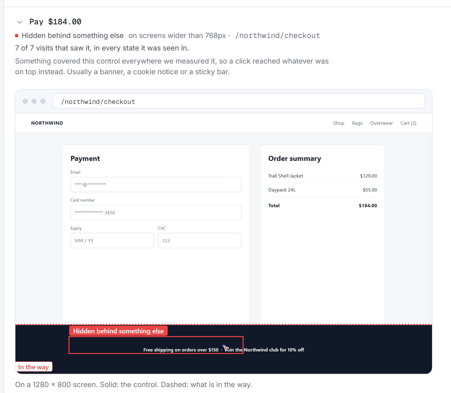
It knows what matters most. The same problem counts once, biggest first, with how many visits met it and on which screens. A problem on your sign-up page for every tablet visitor is never confused with a stray link in a footer.
It names the release. Tell Spectra the name of each release and it tells you, 99% sure before it blames an update, which problems are new with it, which got worse and which are gone, and sends the news to Slack or Telegram so the team hears about it the same day.
It shows product and growth the whole journey. Where people click and how far they scroll, where they came from, including AI assistants like ChatGPT and Perplexity, and what they signed up for or bought, on the same screen as the problems they hit.
It respects your visitors. No cookies, no IP addresses, and private information never leaves the visitor's browser.
When Spectra finds a problem, how hard is the fix?
Usually, minutes. For the problems in this research, almost every cause came down to one of four things, each with a short, well-known fix:
| What got in the way | The fix |
|---|---|
| A cookie notice or banner | Pin it to the bottom edge, keep it slim, and make sure it never sits over your main call to action at any width |
| A see-through layer, like a menu container or a section that has faded in | Let taps pass through the layer, and turn them back on only for the parts people should press |
| A picture or animation growing into a button's space | Lift the button above the picture, or stop the picture overlapping at that width |
| A menu that does not fit | Switch to the compact menu earlier, at the widest width where the full menu stops fitting |
The fix was never the hard part for any of these companies. Knowing was.
The bigger picture
The good news from this research is that young teams build websites that mostly work. The worrying news is that almost none of them can see what visitors actually go through on their websites. A broken experience raises no error, appears in no log and triggers no alert. It turns visitors into people who left, and the website records them as visits.
Spectra is interface intelligence for the web. It sees every real visit, on every phone, tablet and browser your customers use, finds what stands between them and what they came to do, names the release that brought it, and hands you the proof. You find out on the day it happens, not the day a customer finally mentions it, if they ever do.
85% of the newest companies in the world's best-known startup accelerator are flying blind on the pages that turn visitors into customers. Your team does not have to be one of them.
Further reading: what one broken button costs, in real money, and how a perfectly good release breaks signup on a Friday.